
+1
Under review
New BLOX UI: We like it -- with one caveat :)
Refreshed blox UI really taking off here. One thing bugging us a bit.
-- Searchable assets aren't color-coded anymore
It's just tough to scan thru and easily distinguish, esp pdf vs. img
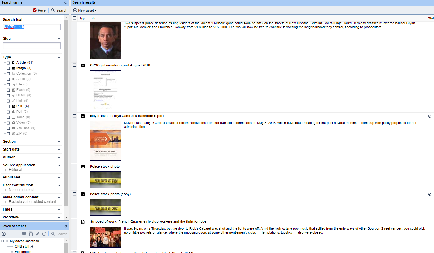
See attached screenshot. Any suggestions or consideration to reverting back or adjusting?
Customer support service by UserEcho

We can definitely look at this. I appreciate the feedback.
A few things:
- Obviously we want to try to keep the general aesthetic with the "flat" icons and so forth, but that doesn't mean they can't be improved or tweaked.
- We did experiment with them being all different colors (red, green, blue, yellow, etc.) and it was super distracting (in my opinion) and much harder to "read."
- I do think a small percentage of the issue is also muscle memory... your brain isn't used to it yet so it stumbles on some things that normally you would be able to immediately grasp without effort.
All that being said, I think image and PDF is a good example of something we could look at tweaking in order to increase visual differentiation between them. I'll do some thinking and experimentation on this side, if anyone has more thoughts let me know!
I agree that Images and PDFs are the worst as far as being much more similar now than before.
The others all seem like logical enough changes if a change had to be made.
But even with most of the other icons looking pretty distinct they don't "read" as fast being monochrome as they did in color. But maybe we won't feel that way a month down the road.
I like the new icons a lot better than the old ones, but the colours did stand out more. I think if they kept the new icons, but just had them different colours (like in my really crude example attached) it would be great!
We can switch the icon for the PDF asset to be just the logo instead of the filled background. At some point in the near future, the PDF, Zip, and Flash asset types are going to be replaced with just the File asset type. The file asset type has awareness of different subtypes much like video assets do today. Additionally, the youtube asset type will be going away as it will be merged into the standard video asset type. The reduced icon set would make the icon choices limited to article, image, collection, audio, file, html, poll, table, link, and video - which are all distinct enough. A nice thing that can now be done is you can zoom the browser in and make those icons bigger and crisper - they are still being sized at the moment for smaller monitors.