
0
Thanks
timeline feedback
I was very happy to see the presentation modes for collection assets. I am in the process of implementing several of them. I was most excited to try the timeline mode. Unfortunately it left me disappointed.
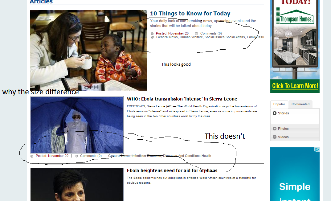
There's too much white space between the arrows. The timeline doesn't size to accommodate more 3 items occurring at the same time (it will work with 4 or more but they sit on top of each other.) The article list looks like an un-formatted mess. In my example if it could accommodate a full size picture it did otherwise it used a 300px thumbnail. I'd prefer as much consistency as possible. For example always use a 300px thumbnail (unless image is smaller). When it used the full size picture the metadata (posted, comments, keywords) showed up under the 1st paragraph text (like it should.) When a thumbnail was used the metadata showed up under the thumbnail which I don't particularly like but could accept if it was consistent, which it's not. Lastly clicking on the items in the timeline does nothing. It should either open the article or at least take you to the item further down on the page.
I love the concept and think with some tweaking it would be a much better. I did a mockup of my idealized version of the timeline. The biggest difference is the current asset is on display between the arrows. As you would click on the arrows or boxes in the timeline that asset would change. Because the asset link, preview, preview paragraph etc would all show up top the only thing needed in the article list is a headline list and maybe the posted date.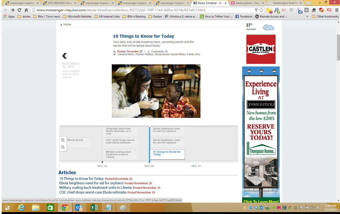
I'm interested in seeing feedback on this and in seeing how other are implementing the new options.
Customer support service by UserEcho

What would you think of just removing the articles at the bottom and ONLY having the timeline? Then users will have to page through the timeline, which may make more sense for the presentation? We are also looking at adding thumbnails to the small story cards in the timeline itself.
As far as the thumbnails showing up in the graphic timeline - not sure, they would have to be very small and there are already issues with overlapping assets.