 Ideas
Ideas
+1
Feature Request: Responsive Image Block
TownNews:
We often use the "Utility: Image file (flex)" block to display landing page headers and other images on our site. The image in the block will conform to the width of the containing region, however, if the image is wide (750px to 1140px) it will often be hard to read when the site is viewed on a mobile device.
I'm wondering if you might consider a block that could include multiple images for responsive design. One image for a desktop view and one for a mobile view.
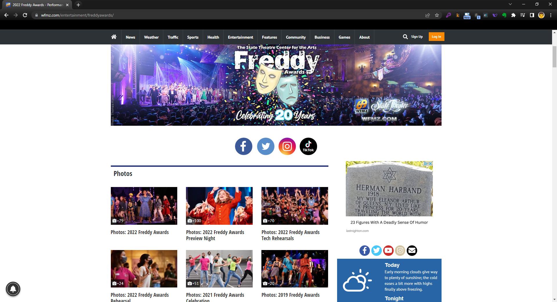
Desktop Website View:
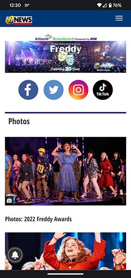
Mobile Website View:
Customer support service by UserEcho

Hi Tom:
Perhaps too little too late, but you could duplicate this with two Utility: Image blocks and two images.
1) Create an image block and give it a good name like "Desktop" or "Large" version. And load the large image in to it.
2) Duplicate (or create another image block and give it a good name like "Mobile" and load the mobile width image in to it.
3) Edit the "Large" image block version as you need to and at the bottom of the Appearance tab where it reads "CSS class:" type in
hidden-xs
4) Edit the "Mobile" image block version as you need to and at the bottom of the Appearance tab where it reads "CSS class:" type in
visible-xs
This will make the "Large" image block visible to your site visitors on desktops and tablets. The "Mobile" image block will be visible to your mobile site visitors.
I have a sample at https://www.collegian.psu.edu/test/
and