0
Custom Properties
a few things drive me nuts about custom properties for blocks
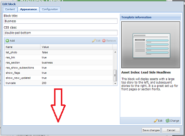
1. Is there anyway for a block template to expose its custom properties in such a way that when you add a new property, instead of typing in the property name you get a dropdown of properties valid for that block template.
2. Not as big a deal, but ditto for properties that only accept a certain list of values. if the only acceptable values for a property are true and false then why not have a drop down of true and false instead of blank box
3. I often take a screen shot of the custom properties when experimenting with changes or duplicating a certain layout elsewhere. however blocks often have more properties than will appear on screen at one time. the appearance tab of the edit block form has significant unused space below the custom properties block. If you expanded the custom properties to use the unused space it would allow you to see more without scrolling and reduce the number of screen shots I take
Customer support service by UserEcho


Funny you mentioned this, because we actually released software last night that provides some big improvements in this area. =)
Essentially, each template needs to be updated to utilize this new capability. Unfortunately, some of the skins and blocks are so complex that it is very difficult to covert them to the new method (while having them grandfather in current settings).
So, all of the new templates that we create use this new methodology, as well as any templates that could be migrated without migration issues. For example, the Touch 5 templates (both the skin URL properties as well as the block), now look like this:
That screenshot shows the "button icon" list property expanded, with all of its possible choices.
No longer will you have to memorize vague properties and obscure values!
No longer will you be stuck in a tiny table window that doesn't expand!
These new properties also have built-in documentation that explain the nature of the property itself.
In the screenshot above (for a Touch 5 block), you can see the tool tip popover when you hover over the property.
Last night's upgrade also added the ability to do multi-line properties (for blocks of text) and hex color values. These will be rolled out in existing templates (where the new capabilities currently exist) over the next few weeks, where appropriate.
Let me know what you think! Thanks again for your input!
Christine
Now that's what I call quick turn around... I think I've seen this format on some blocks before and I think it's a definite improvement ... just so happens I was adding a block I don't normally use tonight and had another thought. To the left of the "Edit" and "Change" buttons under "Template Information" add a "Docs" button that opens a browser tab to docs.townnews.com directly to the template in question. (I'm just never happy am I?)
This is a long term project that we've started, but again, will take some time to complete.
There are a few different tasks here that are part of this overall effort:
Inline documentation for blocks and skins: A lot of the need for the docs site is to look up values and names for custom properties. As I said before, our intention is to have all of these options eventually coded inline into the template set up itself, with proper explanation and inline documentation.
Block examples: Another use of the documentation site is to see what the blocks look like in action. The "template selector" page in docs is one of our most viewed pages! =) We tried to improve this with the template preview schematics (screenshot below), which can help you choose blocks when you're creating them. We're also looking at ways of providing more detail here as well (perhaps more realistic popup detail images).
Help panels: We've implemented searchable help panels in the Template Editor for some users already. We envision this being available in other applications as well. So, for example, you'd have a help panel in editorial that would allow you to search various docs relating to editorial content.
Again, this is a long-term project, but we've already taken many steps in this direction.
Let me know what you think!
Christine