
Recommendation for Mobile/Touch5 article pages (related content)
The biggest complaint we get from mobile users on a regular basis is that they can't seem to find related content on mobile article pages. The "Related" menu option in the footer doesn't immediately jump out at them and it goes largely unnoticed.
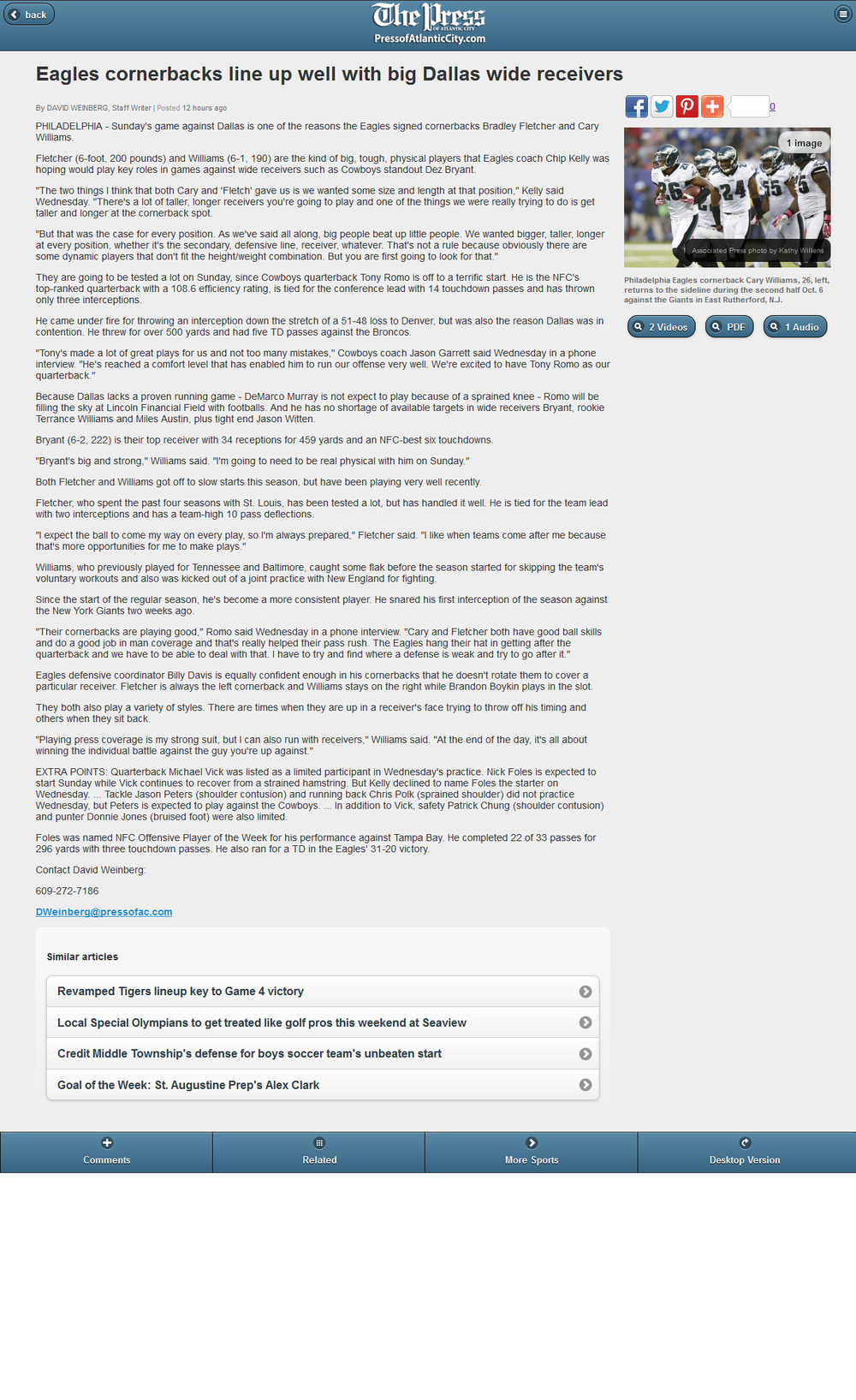
I've included a screenshot of what I think would be a great alternative. Buttons beneath the article photo in the aside column for each piece of related content would seem to work well and allow users to quickly spot and click on related content like videos, audio, etc. The great part is that you are already doing something similar with business listings in the mobile marketplace (which is where I stole the idea/code in the screenshot). It would be great if these buttons could stay at the top of the article when the viewport changes for phone display.
Please let me know if you have any questions. I'm looking forward to using this feedback tool on the regular!
Answer
Awesome job, this will make a huge difference to our mobile audience. Thanks Town News!

Totally agree here; more prominence for related content on mobile would be fantastic; link assets as well as YouTube.

The bottom bar showing the related items is largely a remnant of the old "app"-style design, where the bar stayed on your screen and was much more visible.
Now that people have mostly switched to a more web-like style, it is a good idea to change this.
We will add this to an upcoming release. It may not look exactly like this, but we will do something similar. =)
Thanks!
Hi Mike!
We've now added support to show related assets at the side and bottom of stories (depending on the device size).
All related assets to go the same page, so essentially there is only one link to them, but we now advertise them better on the site.
This change is now live. Let me know what you think!
Christine

Yes, sorry, that was the confusion. Sibling assets are not showing so I will put in a request for that. Thanks!
The bottom bar showing the related items is largely a remnant of the old "app"-style design, where the bar stayed on your screen and was much more visible.
Now that people have mostly switched to a more web-like style, it is a good idea to change this.
We will add this to an upcoming release. It may not look exactly like this, but we will do something similar. =)
Thanks!
The related content is on your site now. If you look at the story "DEP hearing on cracker plant set for May," for example, you'll see PDFs in the right rail under the photo (looking with a horizontal mode iPad).
Customer support service by UserEcho

The bottom bar showing the related items is largely a remnant of the old "app"-style design, where the bar stayed on your screen and was much more visible.
Now that people have mostly switched to a more web-like style, it is a good idea to change this.
We will add this to an upcoming release. It may not look exactly like this, but we will do something similar. =)
Thanks!