 Ideas
Ideas
FLEX right rail regions aren't diverse enough on tablet and phone
In prepping our FLEX site for launch there's been a pretty big frustration with the regions available beginning at the right rail. Desktop is fine. But when you switch to a tablet or mobile phone breakpoint the options available are minimized beginning in the rail. I'll use a screenshot of the Boxy layout at a tablet breakpoint to illustrate my point as it’s the one we chose for our site.
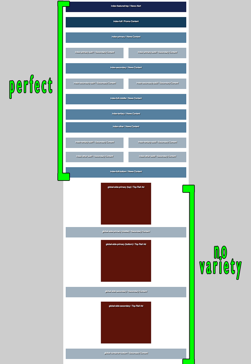
As you can see above the top rail ad is fine. Plenty of rows with one and two columns. But after the top rail ad we’re reduced to full width rows. This presents two problems. 1. As I’ve just mentioned there is a lack of diversity in the regions below the top rail ad. 2. (And this is really design busting) the top rail ad is no longer at the top! That means I have to create a new ad region block specifically to put it higher on tablet and mobile. I ended up just creating a new block for desktop and another for mobile and completely ignoring the top rail ad region.
So the easy solution to this problem would be something like this(and this screenshot will just start at the rail top ad)…
This is more a suggestion for future site launches. But maybe opening up some regions down there wouldn't be site-busting for people who are already on FLEX.
So did anyone else have this problem when launching on FLEX?
Customer support service by UserEcho

We took a different approach using the boxy layout on our http://lancasteronline.com site. We dropped the right rail completely. We don't use one anywhere on the site. Instead we added more regions within the layout and put our ads more inline with the articles. That way when the site goes from desktop to mobile, there are more places for the content and the ads to slot in around each other. We still had to deal with creating a second set of leaderboard ad slots so the ad would be visible when the nav is reduced to hamburger menu. The biggest challenges we've had with using this layout has been keeping columns relatively balanced so the tops line up with each as much as possible and figuring out when to allow the blocks to have the full width of the page.
That's actually a really awesome idea. I really love the lack of a right rail. I feel like over the two decades or so we've been browsing the web we're accustomed to put less focus(as a reader) on the right rail assuming it's less important while the meat of the site is in the main content area on the left. So it's cool you've removed the right rail completely.
Question: How did you create custom regions? I'm not UTL certified but I do have template access for CSS. I'd like to see BLOX allow users to create custom regions more easily. That would really help the issue I have because then I could just add more regions where I need them.
There are other options from which to choose. Have you looked at the pattern grid? You can use it with or without the right rail. And (depending on where you put the ads) the "right rail" becomes more integrated in mobile view.
Also remember that you don't have to use all regions... so you can skip several rows of regions in order to get down to the types of columns you desire. Then, I would look at mobile first, and figure how you want the site to look on mobile, then expand out to desktop.
As a quick example, I set up my test site with the pattern grid: http://www.flex-showcase.bloxcms.com/?gg
You can see how the top rail ad gets placed just below the top news on mobile - so it is integrated into the content rather than just at the bottom.
I really like pattern when I see it in the back-end. The problem was that I originally saw it here:
http://www.flex-showcase.bloxcms.com/grids/pattern/
After seeing it in the back-end of BLOX I realized how different it looked from the showcase page. But at that point we were already designing our site and I didn't think we could handle starting from scratch. I'll get with my project manager and see if it's doable.
But back to the point of this post, my issue would be solved with a few more two-column regions between the big ads in the rail for tablet size. I'm just left with one single-column region between 300x250 big ads.
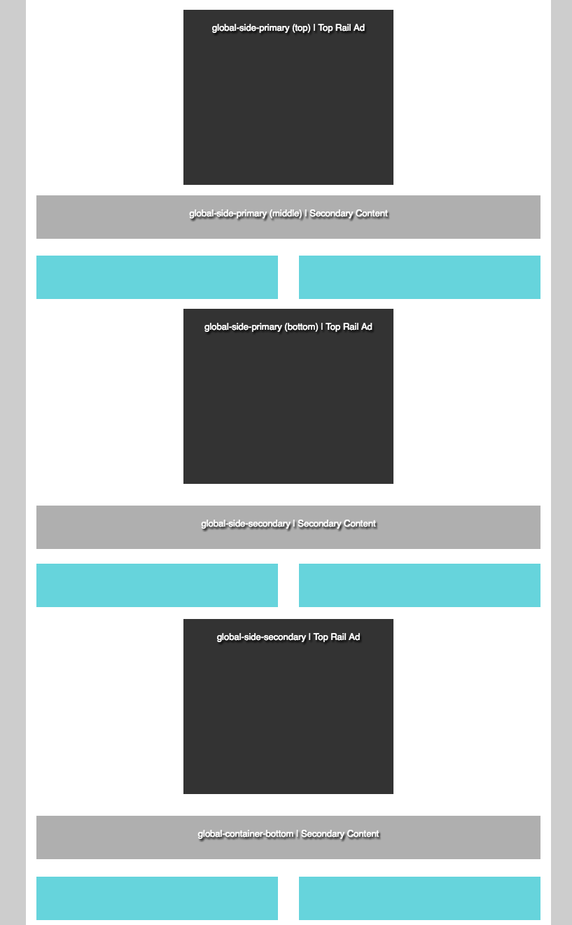
To answer your question about how we created custom regions, we got most of them by asking TownNews to layout our boxy regions per the image I attached above when they were setting up our Flex site. We have since added a few more because we do have people here who are template certified. Like most things, you think you have enough regions on a page until you start filling them up. It would probably be really helpful if users could add regions to pages without needing template access.
We use pattern. (pilotonline.com) But I don't like how the page collapses to a tablet or mobile view. I think it has the same basic problem that Nick described.
Thanks for everyone's input! Even after all of the hours I've put into designing our site on Boxy I'm considering just overhauling it with Pattern. I started a test page with Pattern and it was looking good. The big problem I'm seeing is this white space below the big-ad in small mobile view.
It seems like that global-side-primary region is only good for one asset because there's nothing below the fixed-big-ad-top. And both Christine and Erica's Pattern sites above have HUGE white spaces around the big ad. That's an indication something should be changed with the region layout. I'd be interested in seeing how other Pattern sites handle the big ad. I've tried thinking thinking sideways on this and I can't figure out what would minimize that white space other than just displaying one asset, but even that would cause white space if the photo is vertical.
Perhaps adding another region under the big ad would solve the problem. See an example here...
Which would look like this on the small mobile view.
Problem solved! That would give the designers plenty of space to play around with and would eliminate the white space around the big ad in mobile view.
At this point I'm not even bringing this up for my sake because I'm too far in the design process to turn back now. But maybe this could help future site launches. I think at the very least the grids examples need to be changed. Because this http://www.flex-showcase.bloxcms.com/grids/pattern/ is not a good representation of what the Pattern grid looks like. I saw that and thought "That's not enough regions." Or you could just take screenshots of the actual regions in the backend.
All that being said, I can put in a feature request for new regions or entire new grids if you have really specific requests.
I do, in fact! ;) I'm working on a grid for the right-rail that should solve the problem, at least for Boxy. It can probably be used for the others too. I was originally just going to send it to my project manager to see if we can get a custom rail just for our site but if it's something that would be useful for a feature request I can post it here too.
Sure that would be great! Grids are actually not that hard for us to add, so we can add more if there is need. (It's just hard to QA, mostly!) Someone last week asked for a grid that has a middle column that sorts to the top on mobile (instead of the left column), for example.
Ok, hopefully this will make sense and be doable. I think it's a good fix for the Boxy layout. It may also work with the other layouts. All of the regions are always present.
This is just the rail portion of the phone layout. Everything above front-full-bottom and below global-container-bottom is still there.
I made a mock-up of how I wanted things to collapse back when we were in the design stages of our site, too. I can share that if it's useful to see what it'd take to add or change regions.
That'd be great!
Just a caveat for all of you to remember: All regions must be present at all times. They can move around in different breakpoints, but we want them present at all times by default.
Regions are server side and can't be removed or added based on client side information. So, we can't have a region only show up when in tablet mode, for example. We would have to download it then hide it with CSS, which (although technically possible) is inefficient and we would not want to encourage that sort of thing in a default grid.