
What happened to in-line photos in FLEX?
Zen has fairly decent in-line photo options. If I dragged a photo into the body of an article it would stay right where I put it as long as the presentation was "None." That was great because if the photo was for a specific section of the article it ensured that was where it displayed. The new "Long-form" and "Personality" presentations have abandoned that. FLEX has abandoned that altogether. So even in "None" it puts the images wherever it wants to in the body.
For example...
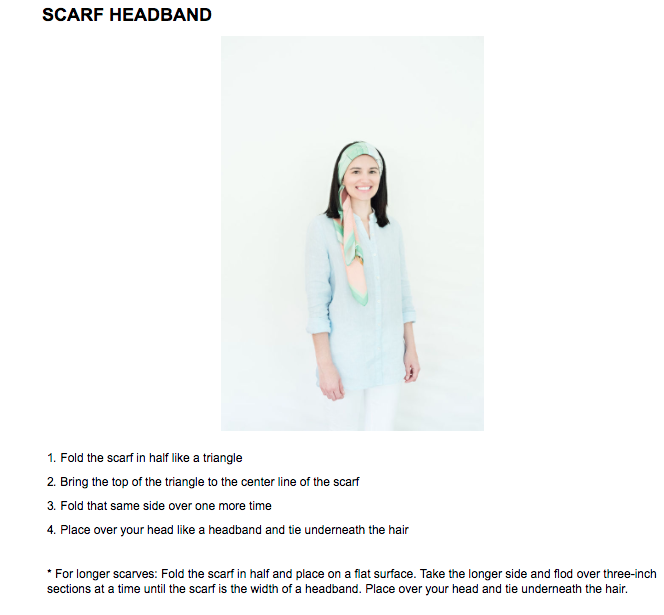
Here you have the Zen photo display. A lot of white space but at least I KNOW the photo will go with the content.
On the other hand...
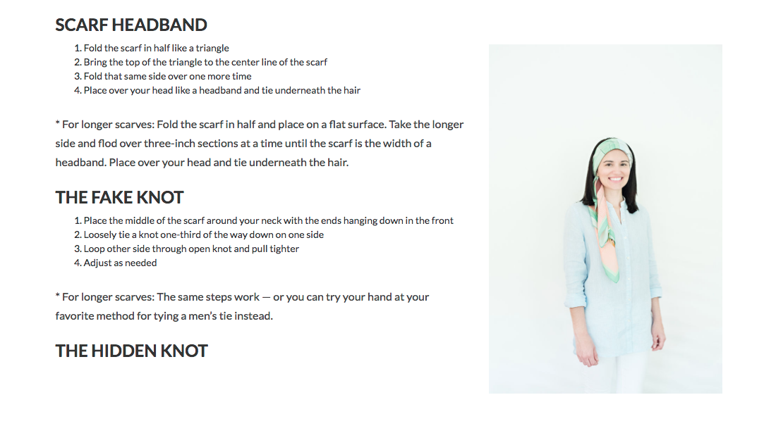
This is FLEX. Is that photo of a scarf headband, a fake knot or a hidden knot? I can't tell.
So could we please have more options for displaying in-line photos? I want to switch our magazine to FLEX because the templates are far superior to Zen. But I I feel like we're taking a step backward when I can't display in-line photos that stay with their corresponding body copy. I'd love to be able to display in-line photos as full width photos so there isn't that white space seen in the top screenshot. But I prefer the white space over the random image placement.
Answer

Flex does full-width inline photos (which was a highly requested feature), instead of 300px like Zen.
The problem was that if you had a vertical image, being full-width ended up with REALLY BIG images that looked pretty crazy.
So now we do a check - if it is a vertical image (as you show here), it will float right. If it is horizontal, it will be full-width. Most of the time this works well since you're just trying to put the image near the copy, and it looks better since it is not super huge.
In your case I would recommend cropping the image to be slightly horizontal (literally one pixel more width than height) and it will be full-width in the article as you intend.
(We do have a feature request in to add some tools to inline photos to give them some options... like half-width, float left, float right, etc. So you can choose more of the display. We are hoping it will be on the docket for next year but I don't have an ETA yet.)

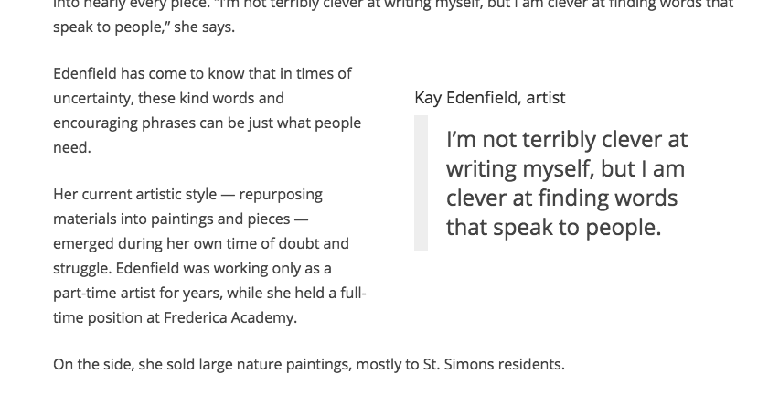
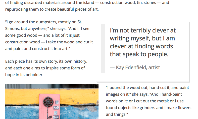
I'm loving the new article designer. One bug I noticed is with pull quotes. When the pull quote isn't dragged into the body of the article the "Title" field becomes the footer of the pull quote. That's perfect. But when the pull quote is dragged as an in-line object the code changes and the "Title" becomes an h4 element. Can we get that changed to have the quote attribution to be at the bottom?
Here's an example...
In-line content
Related box outside the body

Awesome to hear.
The work around I'm using, which helps in several situations where Flex's templates aren't up to snuff, is to use an HTML asset with some CSS in it.
I've got a handful of them saved, and when needed I duplicate them, attach as child assets, and then drag inline. It's a total hack-y solution, but it's the best choice for when it's not something you want to change all the time.

I'm playing around with in-line photos now. They're looking great. But when I try parallax it only displays the photo on the left half of the page. I thought it was CSS messing with the display so I tried the same thing on our two other FLEX sites and got the same result. I'm going to attach a screenshot.
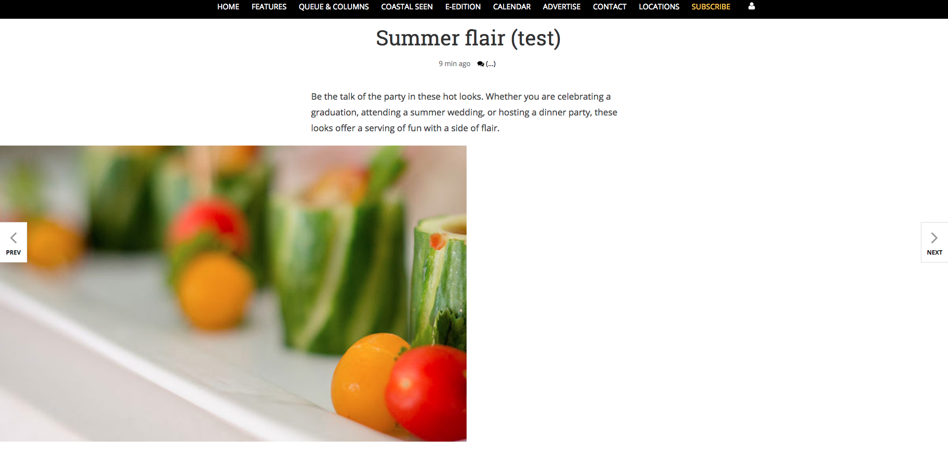

Nick,
I'm having the same problem; asked at the webinar and was told to open a ticket.
Haven't bothered yet. Instead I just overrode the (IIRC) .tnt-parallax class with a "width: 100vw;"
Works for now.
If you look in the CSS the parallax class is set to 100% width, which is 100% of the container the parallax div is in, not 100% of the page. Make sense?
The other thing you need to do with those is override the caption style or else it gets way too wide, looks ugly and worse is difficult to read. I think I set it to max-width: 600px and bumped the font size down a hair compared to regular body text.
HTH
Customer support service by UserEcho


Flex does full-width inline photos (which was a highly requested feature), instead of 300px like Zen.
The problem was that if you had a vertical image, being full-width ended up with REALLY BIG images that looked pretty crazy.
So now we do a check - if it is a vertical image (as you show here), it will float right. If it is horizontal, it will be full-width. Most of the time this works well since you're just trying to put the image near the copy, and it looks better since it is not super huge.
In your case I would recommend cropping the image to be slightly horizontal (literally one pixel more width than height) and it will be full-width in the article as you intend.
(We do have a feature request in to add some tools to inline photos to give them some options... like half-width, float left, float right, etc. So you can choose more of the display. We are hoping it will be on the docket for next year but I don't have an ETA yet.)