0
Under review
[Complaint] New E-Edition format, not the best for mobile. [Screen Shots]
Jeff Sebestyen 8 years ago
in BLOX CMS
•
updated by Rich Griffin | Product Manager (Product Manager) 8 years ago •
3
I am usually very optimistic when we get new updates in Blox. But I have 3 issues with this format.
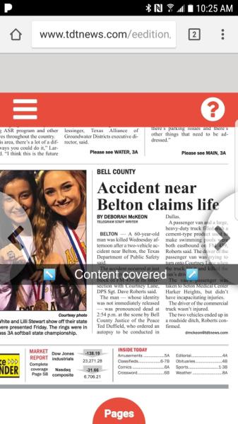
- First, as pictured, the navigation buttons cover up content. Sure, I figured out how to remove the buttons, but my users won't be able to. The deprecated white navigation buttons in the red bar were the way to go. I'd like this to be a Per-Site choice to make.
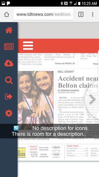
- Second, under the hamburger menu, there are no descriptions as to what each button does.
- Third, because of the update, I have a random gray bar at the top that I now have to fix.
- Forth, I do admire the fact that swiping pages left to right now takes a split second. Finally, the swiping has been improved.


Customer support service by UserEcho


Hi Jeff,
Thanks for the feedback! There are a couple things that I can help you with here.
1. The grey at the top of the page looks to be a result of some custom CSS you have on your site on the main container. Our Customer Services staff would be happy to help you with that.They can be reached at 800-293-9576.
2. We do have a setting available to hide the arrows for those accessing on devices with small screens. It is available from the Gear icon.
3. Our focus with this redesign was to streamline the UX for those on mobile as much as possible. I too considered adding those there. We appreciate your feedback and will consider that moving forward.
Thanks for touching base earlier. I wanted to share an email I've received from a customer..since you guys did all the hard work.
-Russell K.
Thanks Jeff! That is great to hear.