Your comments
When we went live with BLOX Zen in October 2014 we switched from a hard paywall to a metered paywall. It was something we wanted to do before BLOX but as we were looking at BLOX we chose to just wait. I expected a little blowback but I can't remember anything negative from our readers. A few times we've had calls saying "I was due for more free stories yesterday but it still says I can't read them."
Our meter is set to 5 free stories a month and 10 more if the user is registered(but not a paid subscriber) on our website. So 15 stories per month. A lot of people will never see the paywall message.
Thinking back to a hard paywall really makes me question why we did that in the first place(apart from the fact that metering wasn't big until the past few years). Hard paywall or metered paywall aside a lot of people just aren't going to subscribe, period. I would rather have the site metered to get the pageviews.
Our e-edition is totally behind the paywall though. And a lot of people subscribe just for the e-edition.
One believe I have...if you're in a metropolitan area that is covered by a lot of news organizations I don't see a benefit to a hard paywall. If readers can get the same news from another local source when your site requires a subscription they're going to go to the other site. We aren't in a big metro area but we still choose a metered paywall. If you're the only news media outlet in town a hard paywall would make more sense.
I think in today's world a hard paywall is a big turnoff for people. If I knew a site had a hard paywall and I wanted to read something but wasn't interested in a subscription I think in my mind I would just not bother going to the site.
TLDR; I think a metered paywall allows you to build a relationship with a reader that wouldn't happen with a hard paywall.
Ok, hopefully this will make sense and be doable. I think it's a good fix for the Boxy layout. It may also work with the other layouts. All of the regions are always present.
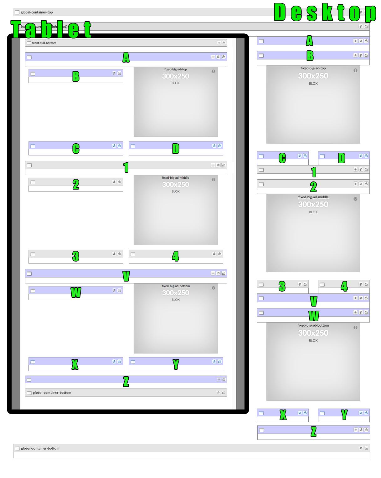
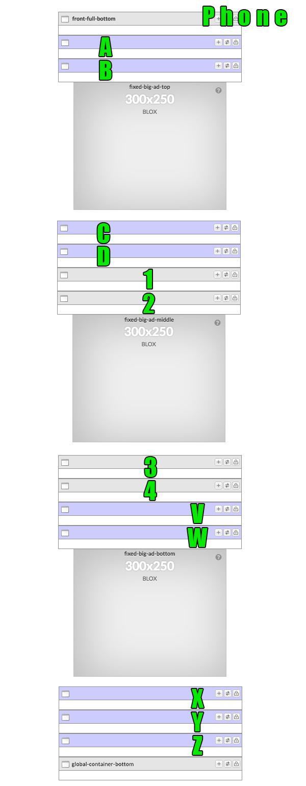
This is just the rail portion of the phone layout. Everything above front-full-bottom and below global-container-bottom is still there.
I do, in fact! ;) I'm working on a grid for the right-rail that should solve the problem, at least for Boxy. It can probably be used for the others too. I was originally just going to send it to my project manager to see if we can get a custom rail just for our site but if it's something that would be useful for a feature request I can post it here too.
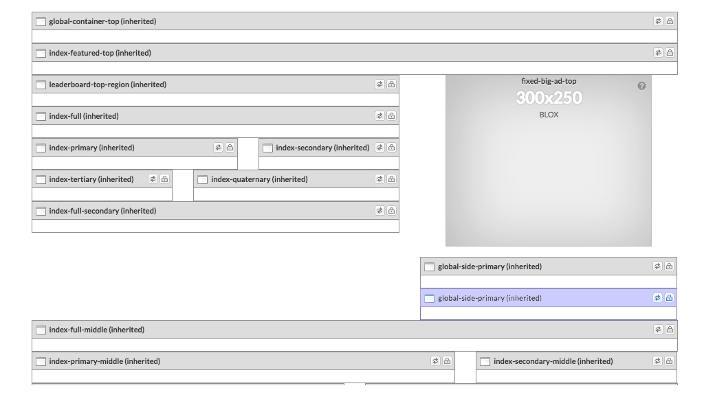
Thanks for everyone's input! Even after all of the hours I've put into designing our site on Boxy I'm considering just overhauling it with Pattern. I started a test page with Pattern and it was looking good. The big problem I'm seeing is this white space below the big-ad in small mobile view.

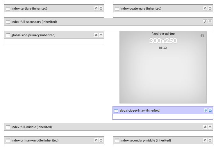
It seems like that global-side-primary region is only good for one asset because there's nothing below the fixed-big-ad-top. And both Christine and Erica's Pattern sites above have HUGE white spaces around the big ad. That's an indication something should be changed with the region layout. I'd be interested in seeing how other Pattern sites handle the big ad. I've tried thinking thinking sideways on this and I can't figure out what would minimize that white space other than just displaying one asset, but even that would cause white space if the photo is vertical.
Perhaps adding another region under the big ad would solve the problem. See an example here...
Which would look like this on the small mobile view.
Problem solved! That would give the designers plenty of space to play around with and would eliminate the white space around the big ad in mobile view.
At this point I'm not even bringing this up for my sake because I'm too far in the design process to turn back now. But maybe this could help future site launches. I think at the very least the grids examples need to be changed. Because this http://www.flex-showcase.bloxcms.com/grids/pattern/ is not a good representation of what the Pattern grid looks like. I saw that and thought "That's not enough regions." Or you could just take screenshots of the actual regions in the backend.
I really like pattern when I see it in the back-end. The problem was that I originally saw it here:
http://www.flex-showcase.bloxcms.com/grids/pattern/
After seeing it in the back-end of BLOX I realized how different it looked from the showcase page. But at that point we were already designing our site and I didn't think we could handle starting from scratch. I'll get with my project manager and see if it's doable.
But back to the point of this post, my issue would be solved with a few more two-column regions between the big ads in the rail for tablet size. I'm just left with one single-column region between 300x250 big ads.
That's actually a really awesome idea. I really love the lack of a right rail. I feel like over the two decades or so we've been browsing the web we're accustomed to put less focus(as a reader) on the right rail assuming it's less important while the meat of the site is in the main content area on the left. So it's cool you've removed the right rail completely.
Question: How did you create custom regions? I'm not UTL certified but I do have template access for CSS. I'd like to see BLOX allow users to create custom regions more easily. That would really help the issue I have because then I could just add more regions where I need them.
I think I get what you mean. I've noticed the photo is often times much bigger than the browser window so you have to scroll around the window to get the correct crop.
And the < and > buttons also disappear at a certain breakpoint somewhere between Medium and Small.
That's what my post was about. Sorry, didn't realize we were talking about the same thing but it sounds like we are.
Customer support service by UserEcho


I don't quite understand the "upgrade path" so I'm not sure what ramifications this will have but I know 1. this CSS is very easy to implement and 2. it's very easy to remove if it causes a problem.
.asset-tags ul li {
text-transform: lowercase;
}
This will force every word to be lowercase though. So you can't pick and choose like "Pinelands Nursery" and "Native Plants" and then have "mail order plants". EVERYTHING will be lowercase. So this may not help.