Though TownNews.com representatives often participate in discussions, this is not a customer service site. For immediate help, call 800-293-9576 or submit a support request via our online ticketing system.

 Bug in the Blox Go mobile admin and bug during batch edit
This creates a problem for ad serving (revenue) that works by section tag.

Join us | Optimizing your BLOX CMS site for speed
 At our July customer webinar, Christine Masters, director of product management, will highlight insider tips and techniques to help make your BLOX CMS site faster than ever.
We'll cover:
- Understanding the need for speed and how TownNews.com's Flex Templates can help reduce load times.
- Evaluating ads, third-party add-ons and other factors that can slow down your site.
- Creating page size & load time budgets to help you stay on track when designing pages and adding new content.
- Future upgrades to rendering, CSS and much more!

 Need "important update" option to save for assets other than just articles
It would be beneficial to have the "important update" save work on assets other than just articles. This could be useful for table and html assets. For example, we publish data or stats as tables. In some cases we replace the table with updated information and it would be helpful or the reader to know that new information is indeed available in the table.

 DFP Unfilled Impressions Flex
Since we launched Flex, we have been seeing high volume of unfilled impressions. I am sure it is because of the class hidden-xs etc, hiding the ad on a small device and not removing it. Anyway to fix this? I am attempting to switch the class names to use visible-sm etc to see if that makes a difference.

 Feature request: Have expandable ad only expand once per minute/hour/day but always displayed
Expandable ads. Advertisers love them, the majority of us hates them. A potential middle ground could be allow the expandable to auto-expand a set number of times per a set period. We have great functionality to restrict the display of an ad to XX times per YY minutes/hours/days. Is that possible for auto-expand?

 Adding a 'date block function' to Blox forms
We would like to see a date block function (similar to AdOwl) so people can't pick certain dates for publications.
1. What problem would this solve?
We have a notation under the dates saying there is a mandatory 11 day waiting period, but people still will pick dates within that time period. We then get people complaining because their submission didn't run in the date they wanted (even though it was under the 11 day period).
2. Why the implementation is needed
This would halt any submissions that try to circumvent the required turnaround time from when the form is submitted to when it will run in the publication.
3. How often would it be used
We currently have 6 forms just for our Celebrations publication that is used all the time by people to submit Anniversaries, Weddings, Birthdays, Retirements etc. We also have other forms that would use this function as well (Letters to the Editor, Obits etc.)
4. How many would use this function
These are forms to get information to run in different publications, so multiple people would benefit from this function.

 PSA: FLEX uses FontAwesome for its icons
This is a two part post. The first part is to suggest a "PSA" topic type for community.townnews.com similar to the "Ideas" "Questions" "Praises." If there's a trick we've learned that isn't template busting or anything it would be cool to be able to share that, especially if it isn't included in help.bloxcms.com. So for the first PSA...
For those of you who use FLEX if you ever want to make use of the text icons you see here and there on your site you can add tons of other fonts. FLEX uses a font called FontAwesome to deliver vector icons. What icons does this include? Check here to see a list of icons: http://fontawesome.io/icons/.
It seems like they only have those listed under "Web Application Icons" and not those included in 4.6. You can even click the icon and it will tell you what code to put on your site.
So if my site had a Harry Potter section and we wanted to include a somewhere we just have to put: <i class="fa fa-bolt" aria-hidden="true"></i>
Have fun!

 Pop up for email sign ups
Hi, Does anyone recommend a third party software for a lightbox or pop up that allows visitors to subscribe to your emails right from the pop up? I am looking for suggestions!

 Newsletter Signup pop up: question and critique.
We did it!
Check out our newsletter sign up here - http://www.utdailybeacon.com/multimedia/
We're still testing because there are still some funky issues.
1. Constant Contact registers 3 instances of the same email, for some reason.
2. The pop up doesn't fully close after signup.
Any tips or suggestions are welcomed, please and thank you!

 Webinar recording: What's new in BLOX Live e-Editions & BLOX Total CMS
At our June webinar, Rich Griffin (BLOX Live e-Editions product manager) and Jon Winters (BLOX Total CMS product architect) discussed the latest updates and new revenue opportunities.
Highlights include:
- Generating revenue with ne banner ad positions for BLOX Live e-Editions.
- Increasing user engagement with cutout asset upgrades.
- Creating a better reader experience with simplified jump segmentation.
- Saving time with improved asset merging and page replication in BLOX Total CMS.
- And much, much more!
For more information, watch the recorded webinar today!

 Business card: Business (Flex)
Is there a way to have mapping as an option on the flex block : Business card : Business (Flex).
The block for Calendar: Card Event has a mapping option. It would be nice to have mapping as an option for the business blocks as well.
Thanks,
Sarah

 How come when you type replies in articles paragraphs are not allowed?
How come when you type replies in articles comment section paragraphs are not allowed?
Thanks.

 GeoIP/Geolocations to customize website experience for users
Additionally this could be expanded to allow site designers to develop blocks that would dynamically deliver the most relevant content based on a users location i.e. weather, news, offers, etc.

 There seems to be a setting forcing lower case letters into caps
Something in the Flex template is forcing the capital even though the user is entering it lower. You can see this on our keyword tags displaying on detail pages.
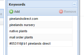
Screengrab of keywords entered lower in the admin:

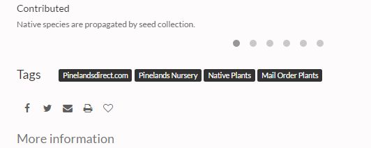
Screengrab of keywords forced upper on the front end:

Can this be changed (we shouldn't force capital letters for style and accuracy reasons) in UTL or in the template so that it reflects throughout the entire site? I put a ticket in but was told if this were modified it would take us off the upgrade path. Would other customers benefit from a fix like so?

BLOX currently forces whatever you type in to be lowercase, so right now everything is lower. We need the keywords to be lowercase for data integrity issues (so that they all search the same).
It used to be that we didn't touch these at all and left them lower case, but we got a lot of complaints, so we started adding a "title case" to them.
However, we have a feature in the system that would keep a "front-facing" version of the keyword (essentially, whatever you type in), and a "search optimized" version which would be in the search index for searching purposes. This will allow you to display things the way they type, but all have them searched the same.
Until that happens, however, Nick's suggestion would work and would not take you off the upgrade path (since it is just CSS). I will update the ticket in the system with this information so our support staff can help.

 Join us | How to generate more revenue with BLOX Live e-Editions

At our June customer webinar, Rich Griffin (BLOX Live e-Editions product manager) and Jon Winters (BLOX Total CMS product architect) will discuss the latest updates and new revenue opportunities.
We'll cover:
- Generating revenue with new banner ad positions for BLOX Live e-Editions.
- Increasing user engagement with cutout asset upgrades.
- Saving time with improved asset merging and simplified page replication in BLOX Total CMS
- And much, much more!
Customer support service by UserEcho

