Welcome to the BLOX Digital (formerly TownNews) customer community! Connect with other BLOX Digital customers—and with us—to suggest features, share best practices and ask questions.
Though BLOX Digital representatives often participate in discussions, this is not a customer service site. For immediate help, call 800-293-9576 or submit a support request via our online ticketing system.
No similar topics found.

0
Answered
 Is there a way to modify the RSS output from BLOX sections?
We're launching a new app and it's only pulling in what is displayed in the RSS feed, which happens to be a single photo and a paragraph.
This is understandably problematic as it doesn't allow the full article to be displayed and makes all our collections pointless to our app audience.
So, what can I do to make our RSS feed show the entire article and all (or even more) associated photos?
This is understandably problematic as it doesn't allow the full article to be displayed and makes all our collections pointless to our app audience.
So, what can I do to make our RSS feed show the entire article and all (or even more) associated photos?

0
Answered
 Sort rules Random
When I set a blocks sort rules to (random) and have the query size set to 1 for the amount of assets to show, it should change the asset that is showing when I refresh, correct? it is not changing though.

Answer
Christine Masters
11 years ago
It doesn't reload every page refresh, but it should change every "page build." Or, any time an updated page is built and cached - which should be every 5 - 10 minutes, depending on the page and the situation, etc.

0
Answered
 AP Flag
OK, maybe I am being blond. :) It wouldn't be the first time.
We are testing the Asset Index: Headlines block on our front page. However, we are feeding AP stories into the block and the "AP" flag is showing.
According to the docs, we can hide a flag, but I've tried every different configuration I'm not getting it to go away.
I'm not doing something right. Anyone? Thanks in advance.
We are testing the Asset Index: Headlines block on our front page. However, we are feeding AP stories into the block and the "AP" flag is showing.
According to the docs, we can hide a flag, but I've tried every different configuration I'm not getting it to go away.
This is from the documention: skipped_flags
With this setting, specific flags can be turned off. For example, if you have a block that pulls in assets that are flagged featured, every asset would have a featured icon next to it. To turn it off: skipped_flags = featured.I'm not doing something right. Anyone? Thanks in advance.

0
Answered
 Having to authenticate EVERY DANG TIME...
Kelly Thomas (DE Admin) 11 years ago
•
updated by Aaron Gillette (Marketing Director, TownNews) 11 years ago •
4
Having to authenticate EVERY DANG TIME I want to watch a video discourages me from actually watching training videos. 1PWord won't even create a login >:-(
http://townnews.com/shared-content/perform/?domain_name=townnews.com&form_template=training_videos&tra
http://townnews.com/shared-content/perform/?domain_name=townnews.com&form_template=training_videos&tra

0
Answered
 AP Syndication requirements in Webinar: What's new in BLOX CMS (December, 2014)
Christina Masters mentioned new AP syndication requirements in the December 2014 Webinar. I'd like more information about the exact requirements. Is there an announcement from the AP or documentation that you could refer me to?

Answer
Christine Masters
11 years ago
Hi Jennifer!
We have a great doc on this here:
http://docs.townnews.com/kbpublisher/How-do-I-set-up-an-Associated-Press-Syndication-Channel_8966.html
You'll need to get your login information from AP. But, other than that, it is very easy! =)
We have a great doc on this here:
http://docs.townnews.com/kbpublisher/How-do-I-set-up-an-Associated-Press-Syndication-Channel_8966.html
You'll need to get your login information from AP. But, other than that, it is very easy! =)

0
Under review
 smart truncating
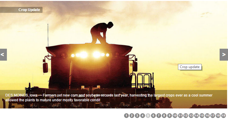
User today wanted to know where the rest of a caption was. Seems they were looking at the sildeshow block and the caption was truncated mid-word at about 180 characters.
I was wondering about truncating in general... when doing so instead of truncating at the exact character count... Could you not go back the last space prior to that and truncate there with a "..." appended.
In the example (see image below) the truncated caption would be;
"DES MOINES, Iowa — Farmers set new corn and soybean records last year, harvesting the largest crops ever as a cool summer allowed the plants to mature under mostly favorable ..."
instead of
"DES MOINES, Iowa — Farmers set new corn and soybean records last year, harvesting the largest crops ever as a cool summer allowed the plants to mature under mostly favorable condit"
That way the reader would receive an indication the text was truncated purposefully and and was not ;an error.


0
Answered
 Leverage browser caching
Craig V 11 years ago
in BLOX CMS
•
updated by Patrick O'Lone (Director of Software Development) 11 years ago •
4
Does anyone know if we have access to .htaccess file in blox to leverage browser caching

0
Answered
 settings > Jobs > youtube
Can I create a mrss job feed from youtube to create individual youtube assets in blox?

Answer
Christine Masters
11 years ago
Hi Craig!
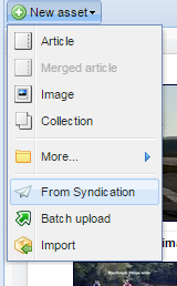
I would actually recommend the Syndication tool. It's free and should be available under Editorial.
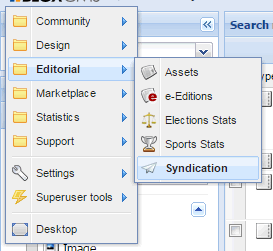
Using the Syndication tool, you can set up a channel to YouTube - based off of a user account or a keyword.
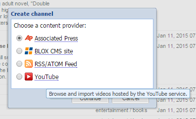
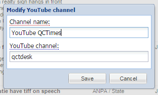
Then, you can either just pick and choose from the Syndication channel the items you want (it is really nicely integrated with Editorial).
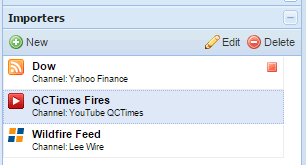
Or you can create an importer to feed all of the items in automatically as YouTube assets. You can assign them a keyword, flag, section, delete date, etc.
I would actually recommend the Syndication tool. It's free and should be available under Editorial.

Using the Syndication tool, you can set up a channel to YouTube - based off of a user account or a keyword.


Then, you can either just pick and choose from the Syndication channel the items you want (it is really nicely integrated with Editorial).

Or you can create an importer to feed all of the items in automatically as YouTube assets. You can assign them a keyword, flag, section, delete date, etc.


0
Answered
 Custom Properties for Site User Accounts?
I see that custom properties are able to be set for site user accounts, which is interesting.
However, I found nothing in the documentation about them. Are they available for use in UTL or elsewhere in Blox?
However, I found nothing in the documentation about them. Are they available for use in UTL or elsewhere in Blox?

0
Answered
 Can we allow users to select multiple answers in a poll?
We post a yearly "Top 10" poll where we ask readers to vote for the top news stories of the year. We've used PollDaddy in the past. Trying to reproduce something similar in TN, but I don't see a way to allow users to select more than 1 answer (i.e. "you may select up to 10 from this list"). Is there a custom property that allows us to set the max. number of items a reader may vote for?

0
 Interstitial ads
Can interstitial ads be placed on sections fronts(as well as home page) of touch 5 or only assets? Not that I am a fan of this idea, but I was asked if it was possible.

+2
Under review
 Need a way to manage the display of new urls, section tag, site index, rss, etc. in one menu
When new applications are installed (in our case Tributes) by project managers or the like, new urls (and section tags) need to be excluded from site indexes and RSS options until the products go live.
I have more than once found new urls created (not by my staff) in our site index and rss options. Our readers use our site index.
Feature request: We need a way to manage the display of new urls, section tags, site index, rss, etc. in one menu. In the admin when creating new urls/sections, it would be great to have the option to select a checkmark to hide or display urls/sections in the site map, rss, etc. (The current "exclusion" fields are limited.)

Answer
Christine Masters
11 years ago
On the normal article page, we can't have full width inline photos due to the "media box" inset into the article. It is difficult to know how "tall" the media box is, causing users to place items next to it which end up overlapping.
So, we've created some new article modes such as the longform article. When all items are placed inline, they end up being full width across the entire page.
So, we've created some new article modes such as the longform article. When all items are placed inline, they end up being full width across the entire page.

0
Answered
 longview presentation - cutlines
I like using the Longview presentation for what we call our "Lifestyle" pieces.
However, if you pull the photo into the copy, you lose the cutline. Is there a photo presentation option I can use to keep the cutline working? I've tried showcase, but of course, it moves it to the top of the page.
http://www.starherald.com/entertainment/air-link-receives-state-of-the-art-helicopter/article_bd3e8753-5626-54e9-b446-5535dc92cede.html

Answer
Christine Masters
11 years ago
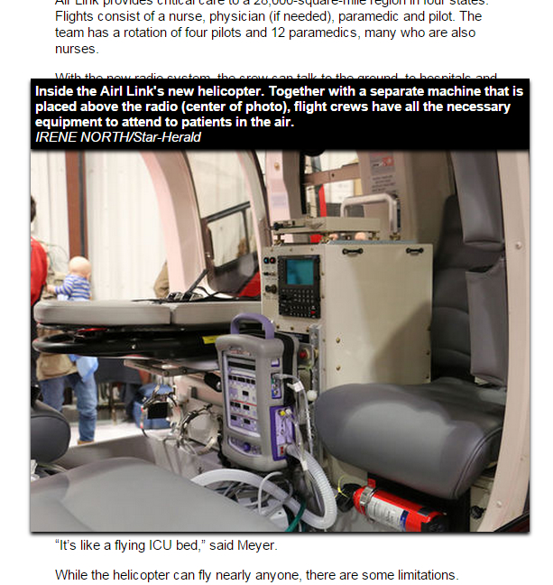
The cutlines are there, you just need to click on the photo to see it. We did it this way because sometimes cutlines are so long that they cause a huge break in the story that it is distracting.
However, I'll see if there is a way we can 'hint' to the user that there is more if you click on the photo. Maybe it needs to do something on a mouseover or something...
However, I'll see if there is a way we can 'hint' to the user that there is more if you click on the photo. Maybe it needs to do something on a mouseover or something...

Customer support service by UserEcho


