Though TownNews.com representatives often participate in discussions, this is not a customer service site. For immediate help, call 800-293-9576 or submit a support request via our online ticketing system.

 Has anyone tried this ad layout on their article pages?
Just curious to see if any BLOX customers have tried this side-by-side/300x250 ad layout within story text? Seems to be catching on in the industry.

 Multiple Calls to Action in single ad?
Hello all: I'm new to BLOX and am trying to learn as I go along. I have a client that has provided me with an image ad and has requested two different links be embedded based on where the page viewer clicks. I'm afraid this would require that the ad be an html ad, but I've not been able to find any documentation as to what I need to do to get this ad posted. Any help from fellow experienced users would be greatly appreciated.

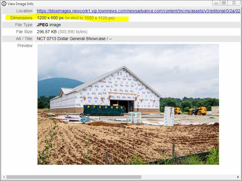
 Request: Larger image size for full-bleed inline images
When Article Presentation = Long-form & Inline Image Presentation = Full-bleed, it looks like Blox displays the image at 1200px width (URL: ...image.jpg?resize=1200%2C800) and then uses CSS to size up to 100% width. On viewports wider than 1200px this causes the images to go fuzzy.
My suggestion is when Article Presentation = Long-form & Inline Image Presentation = Full-bleed, the image resize should go higher, e.g. 1920px.

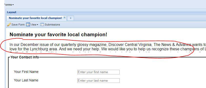
 Feature request: Add rich text editor to form header
Feature request: Add the rich text editor to the header of a Form (under Design > Forms) so form headers can have paragraph breaks, bold text etc.

 Facebook Messenger Breaking News
Hi there, I was on the meeting today when TownNews mentioned a new feature on how to push news articles out through Facebook Messenger. I am very interested in this feature, but I haven't been able to find it within our account. We have a flex system and this is something that our paper wants to use immediately if available. If anyone knows how to do this please let me know!

 End time for poll asset
I'm not seeing a setting on poll assets that allows the user to set an "end" date for the collection of submissions. Is there a way to do that? For example, I'd like to collect submissions for one week, end submissions, but then still display the results.

 WCAG 2.0 AA for the disabled
Have you guys implemented any best practices for our FLEX websites to be compatible and read by people with disability?
This is the topic on a webinar that I was invited to: WCAG 2.0 AA

 Classified Ad Refuses to Publish?
I've had this happen with an article before and it's completely ludacris. No matter how many times I try and post it, including deleting the ad and starting a new one, it refuses to publish to the website. Are there some sort of page-breaking symbols I'm unintentionally adding?

 Implementing 360 videos and photos
With "VR" and other 360 degree cameras becoming more readily avaliable and affordable, we need a way to be able to upload and share our photos and videos. We can get it to work with HTML assets and other tricks, but it would be nice if it was "dumbed down" for our editors so they could just make a 360 asset and be done with it. Google has a VR viewer that could easily be intergrated into BLOX.
https://developers.google.com/vr/concepts/vrview
There is also Pannellum, which is what we're using: https://pannellum.org

 Love the photo-swipe part of 'utility: full article' ... can that be applied to 'card: showcase' as well?
Was wondering that photo-swipe option found in 'utility: full article' could be included as an option in 'card: showcase?' Or maybe it already is and I'm missing it?

 Any way to add block to story pages for specific section/urls?
Hey all...
Like the title says, is there any way to automatically add a block into a story page?
I've got a funky secondary nav I want to add to a section of our site, and I don't see any easy way to do it.
I'm honestly thinking the easiest way might be to use javascript to create the elements on each load, which is just absurd...I'm sure there's an easier way that I'm missing.
Thanks Folks

Would putting the block that you want on the pages into the Utility region for All Assets Top of Main Container work?
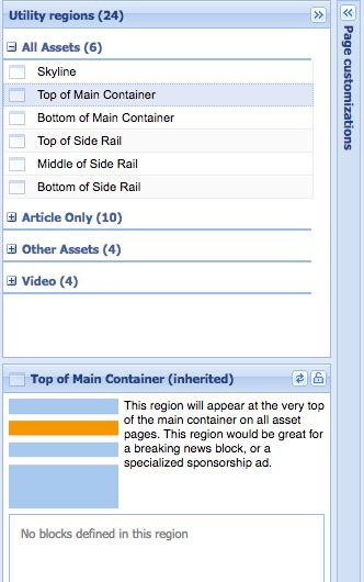
If open the Utility regions for a section, then anything you put in those regions only applies to that section. If you want something to apply to the whole site, you open the Utility regions on your homepage layout.

 How do I add author biography and story recommendations under an article?
Is it in the utility regions under Bottom of Artilcle?
Mainly want to know how to create a block with recommended articles that will display under an article. What kind of parameters like sections would I set to that block so it would show recommended stories? Or is there a way to automatically set that?
As far as creating author biographies for employees (or in our case freelance writers) would they have to be the one to create the assets within BLOX or is there a way for us to set the author as a different person and create accounts for them?

For the recommended articles, the first question that I have is how are you determining what articles to recommend? If you signed up for the iQ Engage program (https://www.townnews365.com/solutions/products/data_management/iq-engage/article_3d0cdd9c-0ff8-11e7-a92b-e3179d72894c.html), you'll want to use a Card: Grid Behavioral block (https://help.bloxcms.com/knowledge-base/applications/design/blocks/page_customizations/article_549440ba-1325-11e7-bf32-8b5023483ffd.html). I believe you use the Asset query field under Content to determine what articles get shown to the user. And each user will get a set of articles that based on his or her preferences
If you aren't using iQ Engage and you are picking a set group articles to recommend all readers no matter what their preferences are, such as articles flagged Editor's Pick or just the articles from a particular section, then you would use a regular Card: Grid block and set up your query parameters to pull in just the articles with that flag or from that section.
In both of these cases, you would put the block that you make into a utility region. I believe the Bottom of Article region is one that TN suggests for the placement of iQ Engage block, but you could put the block in another region if you really wanted to.
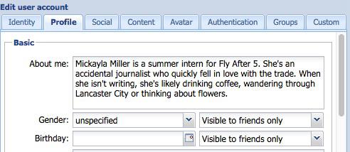
For the author bios, if you are talking about something like this:

you put that text in the author's user account on the Profile tab in the About me area.
You'll also need to make sure that the page customizations for the site or the section that the articles are includes both the byline and the author or just the author depending on what you want. That setting is under Misc and it's called Asset author display. You don't need to create any blocks for this. The author display setting takes care of adding the information automatically.
Once you have created the freelance writer's account, you can create the asset and pick that person as the author. The freelancer doesn't have to create the article.

 We would love to be able to center tweets using the Twitter function within a story asset.
We are loving the new alignment features that were just released for child assets. Stories are way more engaging and better looking with the new options. We've tried to use the Twitter function, but have noticed those cannot be formatted. Would it be possible to have them automatically centered in stories, or given the option to align right, left, center like the other child assets?

Actually I think you're right. It is left-aligned (but not floated) on regular stories. On long-form mode, it sticks out awkwardly to the left.
I will see if we can center both with CSS for now.
Adding alignment options will be more complicated than a simple CSS fix, but I think that's a good idea if it is possible.

 Auto approve updated calendar events
When someone creates a calendar event we get a notification to approve the event. That's great. But if they update the event we get another notification that we have to approve the update. I don't want new events to be auto approved but I would like updated events to be auto approved.
Can we get an option to auto approve updated events?

Hi Nick,
Providing an option to auto-approve event updates would be a feature request. I would be remiss if I didn't point out that this request would allow users to update previously approved events with descriptions or images a site might deem inappropriate.
Has that been considered?
The current workflow, while it may require additional time, allows for proper vetting at each point during the submission process.
Customer support service by UserEcho


